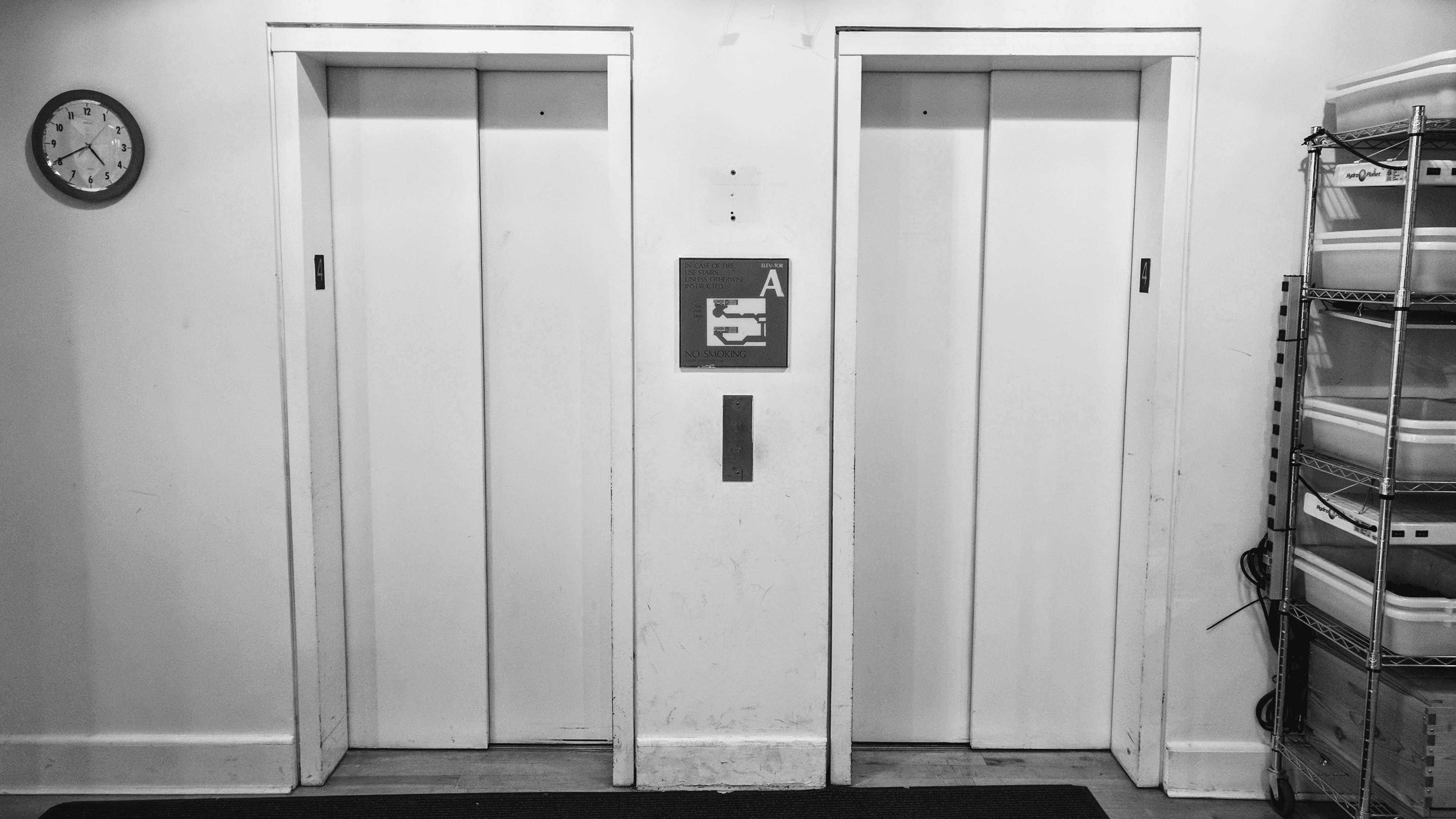
For Physical Computing, we were asked to observe a piece of interactive technology in public and take some notes about how it was being used. I chose the elevators in the Tisch building.
There were a few things that people seemed to find difficult about using the elevators:
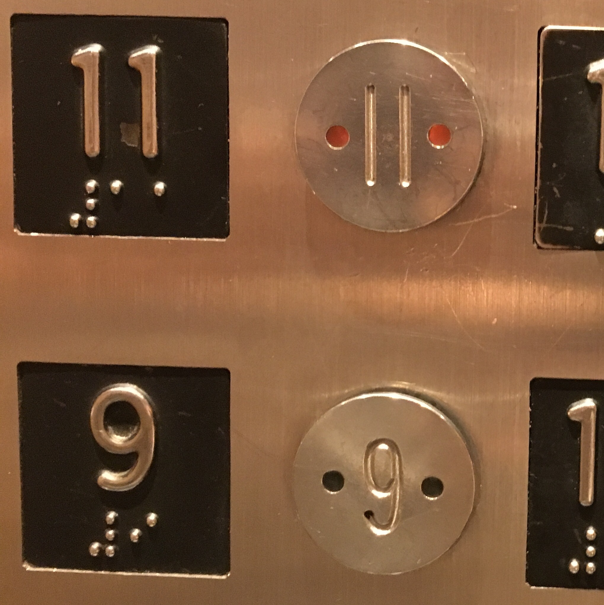
The buttons light up very dimly when pressed, so it’s difficult to tell at a glance whether a given button has already been pressed. Multiple times, I saw people press a button for a floor that had just been pressed by someone else a few seconds ago.
Most of the floors, except for the first floor, don’t have floor indicators that show where the elevator is and which direction it’s headed in. On higher floors, people couldn’t easily tell how far away the elevator was, and couldn’t tell which direction it was headed in until after the doors opened.

Another thing that I noticed was that when someone needed to stop the elevator door from closing, they were more likely to hold their hand in the path of the door vs. using the “Door Open” button, taking advantage of the safety feature that prevents the elevator from closing when there’s something blocking the infrared light sensor in the door. This suggests to me that blocking the door with your hand to keep it open is a more intuitive interaction than holding down a button.